↓ Interview below artwork.


Wild & Scenic interviewed me about the poster:
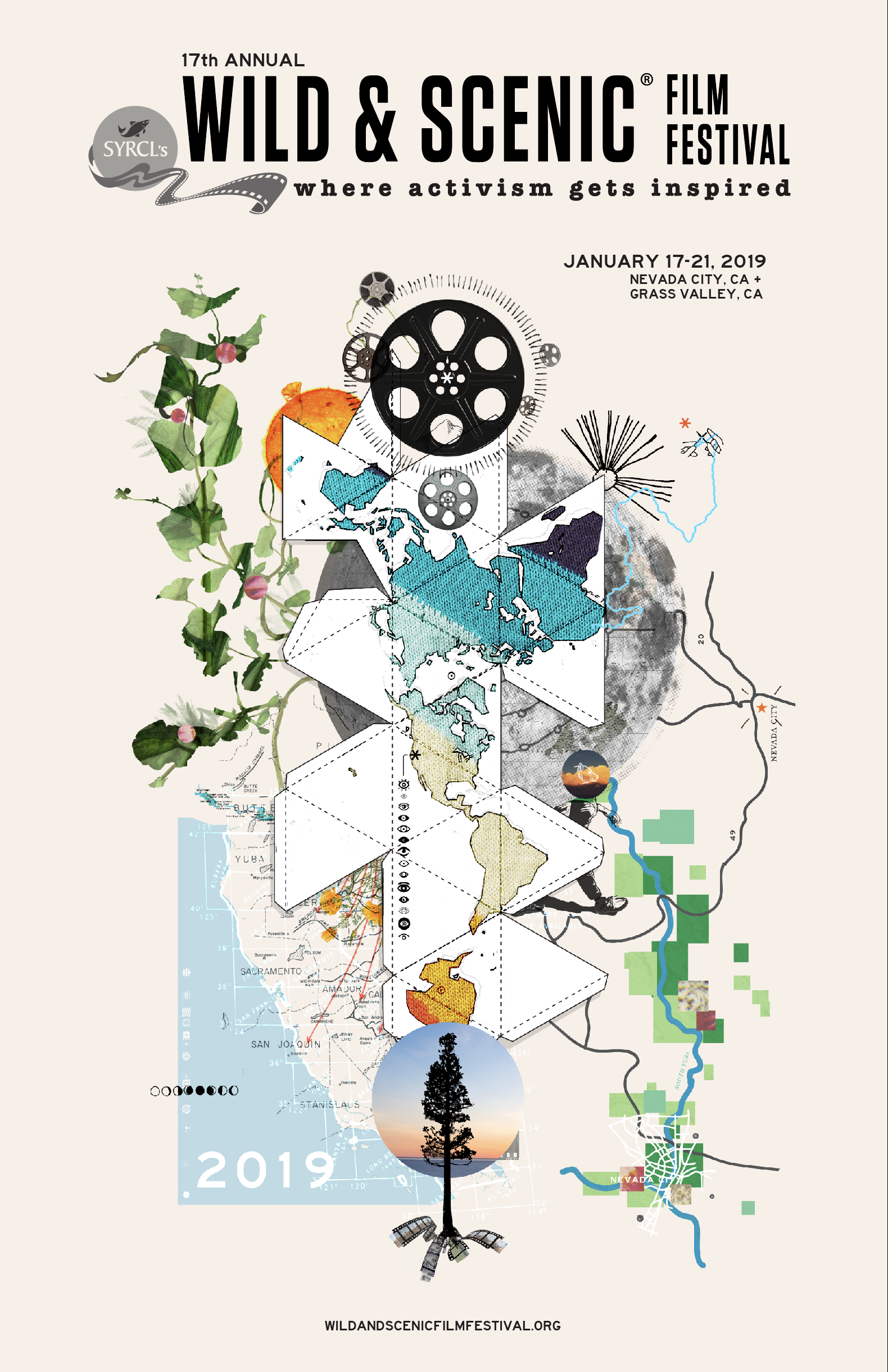
We are pleased to reveal the official artwork for the 2019 Wild & Scenic Film Festival, created by graphic designer and artist Lawrence Lander! Festival Producer, Jorie Emory, had the opportunity to chat with Lawrence about his vision for the poster.
JE: Tell us about yourself. Who is Lawrence Lander?
LL: My title is Art Director at Peak Design. I’ve been at Peak for three years, and I oversee our visual identity, strategic brand discussions, and work with my team on the products we make. I studied Design in grad school at the California College of the Arts in San Francisco, and have my undergrad degree in Photo Journalism from the University of Texas in Austin. I enjoy doing side projects as a way to stretch my legs. I attended Wild & Scenic in 2018 with some of my colleagues from Peak, so I have a familiarity with the Festival and was excited to work on the poster for 2019.
JE: Can you walk us through the artwork you created for the 2019 Wild & Scenic Film Festival?
LL: In my experience, posters have to hook the viewer and then engage the viewer. I like the idea of bringing someone in and then keeping them engaged by including lots of smaller details that reveal themselves upon closer look.
With this poster design, there’s a lot going on! The focal point is the map, which is a type of projection map I have always liked as a beautiful way of showing the interconnectedness of all the landmasses. The shape of countries and continents becomes a symbol of those continents. I played with the familiarity of these shapes, but with unexpected delightfulness.
Riffing further on maps, I included some artist illustrations of the Yuba River and public lands that surround in the area, highlighting areas that are protected. Echoing the river from the bottom right, I combined a mix of imagery of vegetation, to the design to add some vitality, and make it come alive. There are several overlays of maps of California from a variety of eras, including the Gold Rush, to reference different relationships with the land over time.
I included a few other California references to acknowledge Wild & Scenic Film Festival’s roots in California and the universal appeal of Californians putting our best face forward, including California poppies and the bear hiker.
I added the knitting imagery to reference interconnectedness and the work of humans, relating to the work needed for protection and conservation.
And of course, the film reels, because this is a film festival! I like the antiquated version of the old film reels because I think the symbol is powerful, playful, with some reverence of the media.
Overall, there’s not a wrong way to interpret it. Create your own adventure! Insert your own stories!
JE: Your artwork uses a lot of collage-style imagery. Can you tell us about your approach to art and design? Why collage?
LL: I use collage to push myself as a designer. Many designers create images that are beautiful or simple or modern and don’t ask “why.” I go to the opposite end of the spectrum, pulling together lots of components to to make something beautiful that communicates an idea. I like that two different things, when added together, create this new third thing. It’s like magic.
JE: Our Festival’s tagline is “Where activism gets inspired.” What inspires you?
LL: I’m totally inspired by when human beings do good. I love the outdoors and spent a lot of time in National Parks with my family. At some point, I realized that these places are only possible through a concerted effort of human beings to protect them. For me, it’s hopeful. We have already accomplished good things, and we can continue that. This is all a big part of why I work at Peak Design. We are trying to create a new paradigm. If this inspires others, it’s a good thing!